Optimization of the brand’s overall visual design, prototyping of existing and future web application interfaces, and creation and maintenance of the company’s design system. I had the privilege of serving as the lead UI designer, playing a key role in optimizing the brand’s visual identity. At Agipi, a subsidiary of AXA, I collaborated closely with team leaders, business analysts (MOA), technical analysts (MOE), project managers, as well as back-end and front-end developers.
My role
Lead User Interface designer
Responsabilites
My contributions included creating mockups for both existing and future web application interfaces, as well as developing and maintaining the company’s design system. I successfully designed a wide range of projects that catered to the needs of the brand’s policyholders, the agents responsible for selling insurance contracts, and the internal teams who manage a significant volume of insurance agreements. Together with my UX designer colleague, we engaged from the very onset of project requests, conducting user tests and facilitating co-design workshops. These activities informed our development of user journeys. Following this collaborative phase, I took charge of creating wireframes, mockups, and prototypes, which we iteratively refined and tested before moving into production.
Design system
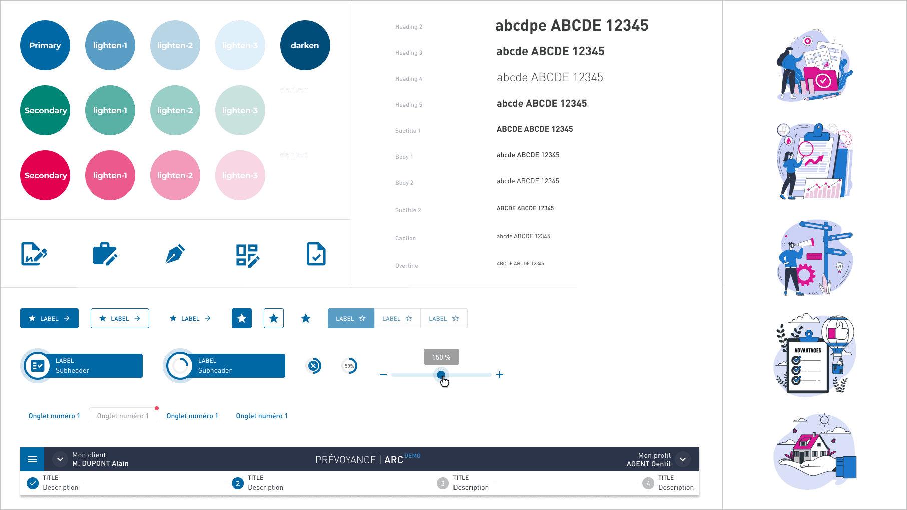
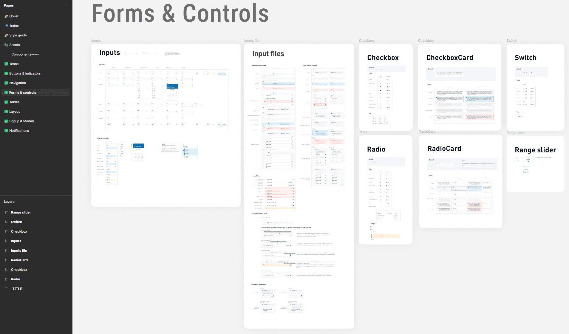
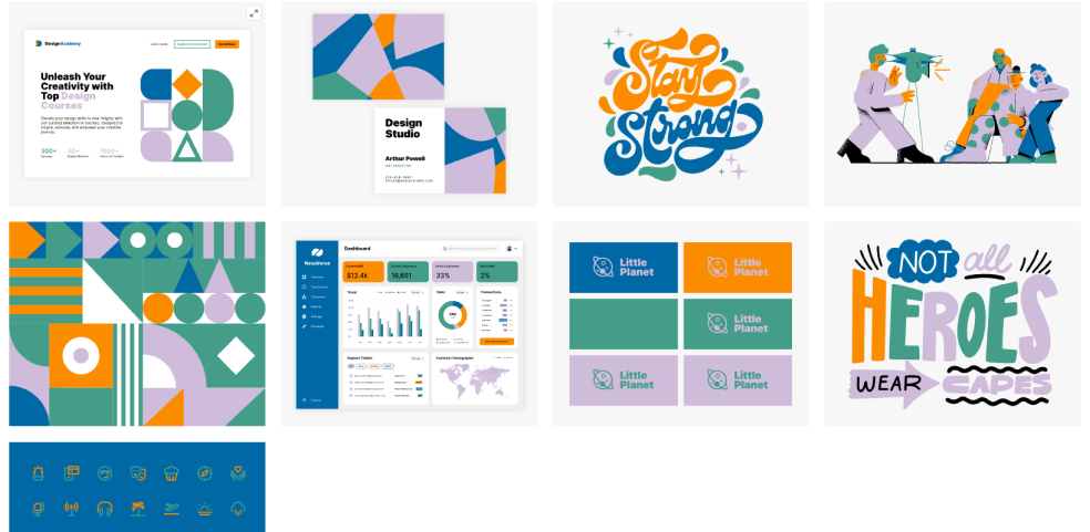
I had the opportunity to take over, recreate, and optimize the design system for the company’s online tools. A design system is akin to a brand’s style guide, but instead of theoretical guidelines, it provides ready-to-use elements. Before creating a website or an application, we aim to establish reusable design components as a foundation—such as buttons, menus, icons, and input fields. With Figma and object components, everything can be reused and optimized. We can create responsive and adaptable components, ensuring a consistent and efficient design process
Small snippet of the design system...
Tools for Design system
Figmais a collaborative tool for design and prototyping, enabling the creation of components, mockups, and interactive prototypes that simulate a website or app’s final look.
Storybook, more developer-focused, provides a coded component library, making reusable components accessible for all projects, with support for parameters and documentation.
I also used Zeroheight, a reference tool for all stakeholders, offering comprehensive guidelines, component usage standards, and practical examples or counterexamples that clarify the design system’s applications.
Lastly, tools like Jiraor Trello helped track component progress, showing responsibilities and the status of tasks, whether in design, development, or ready for delivery.
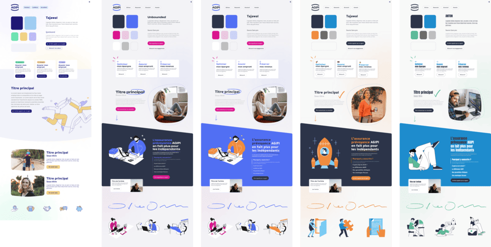
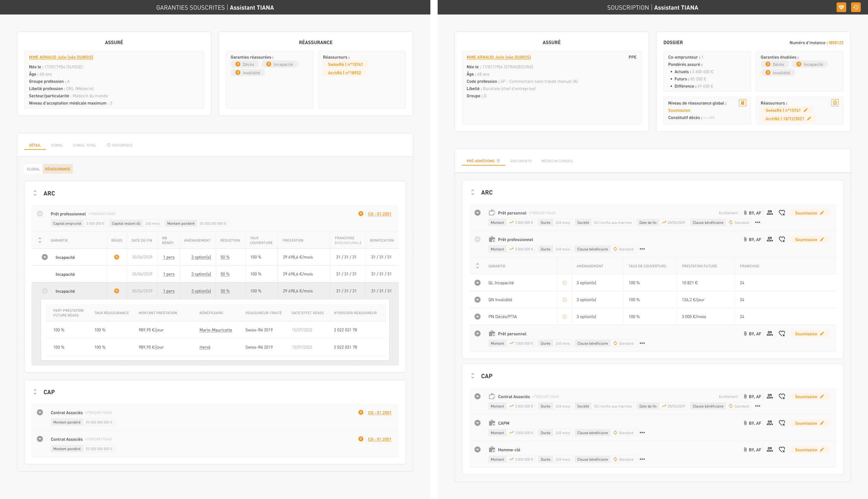
Structure of the design system and example
Design
I designed diagrams and storyboards to better understand and structure the information and architecture of websites and applications. After creating paper wireframes, I developed digital wireframes along with a low-fidelity prototype, which allowed me to conduct initial usability studies.
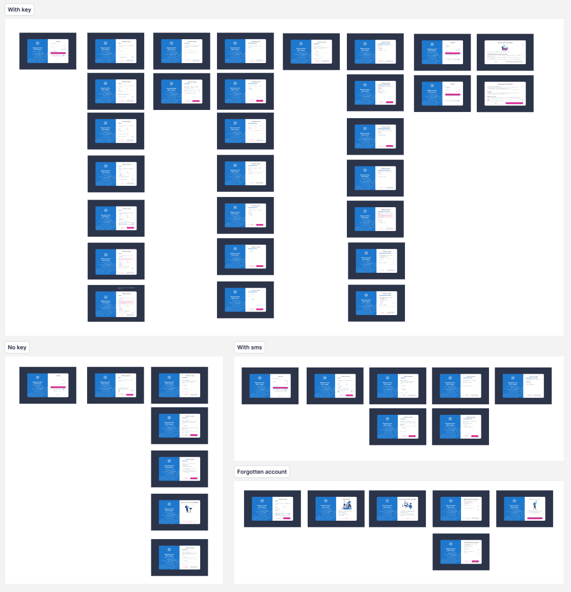
Wireframes
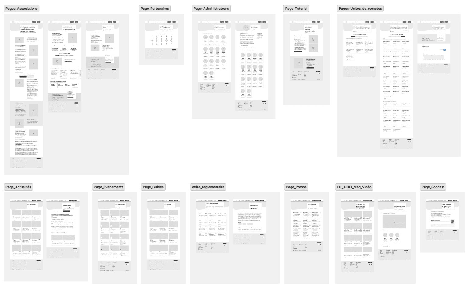
After sketching wireframes, we moved on to the most tedious task of the project on Figma: creating wireframes
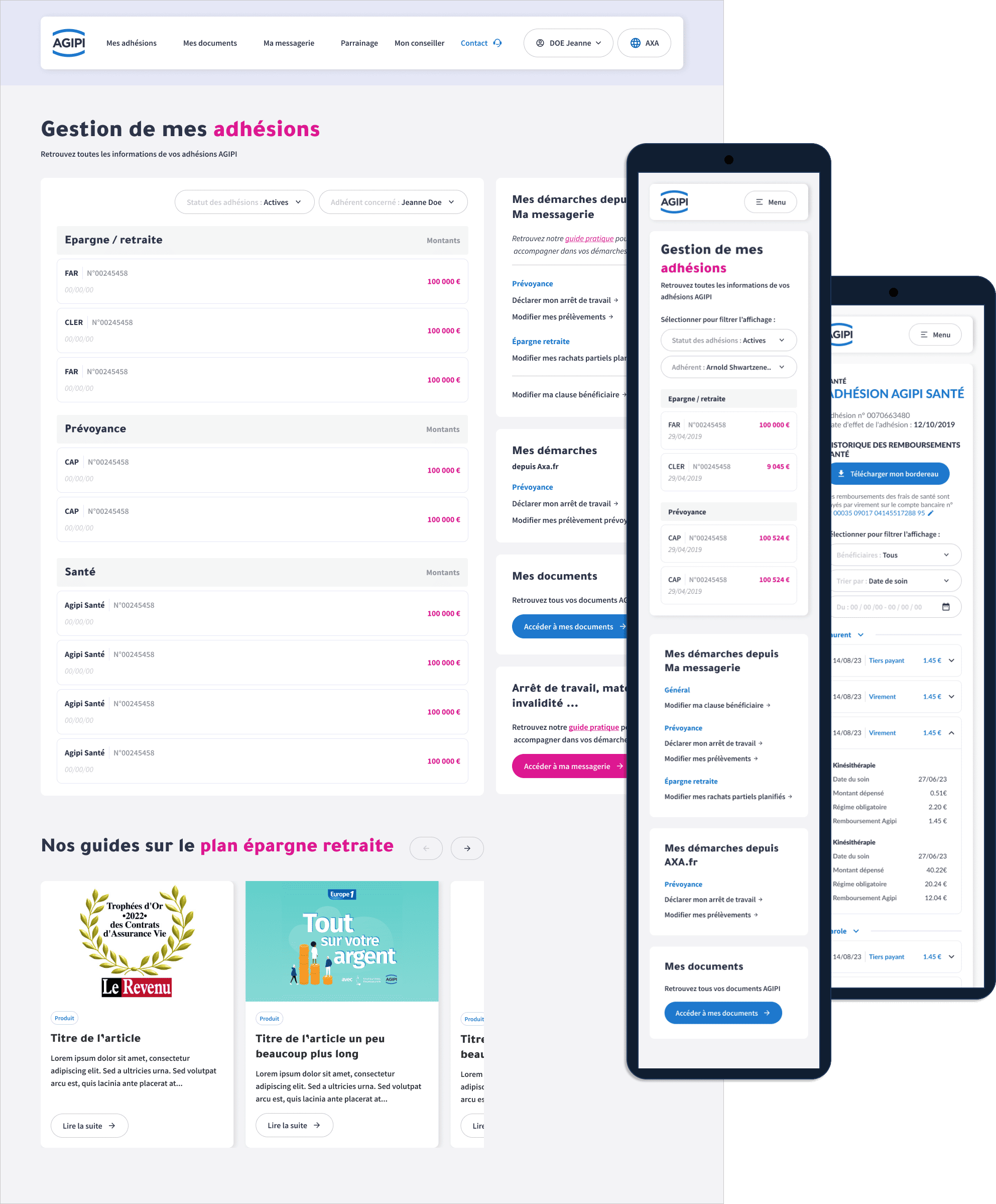
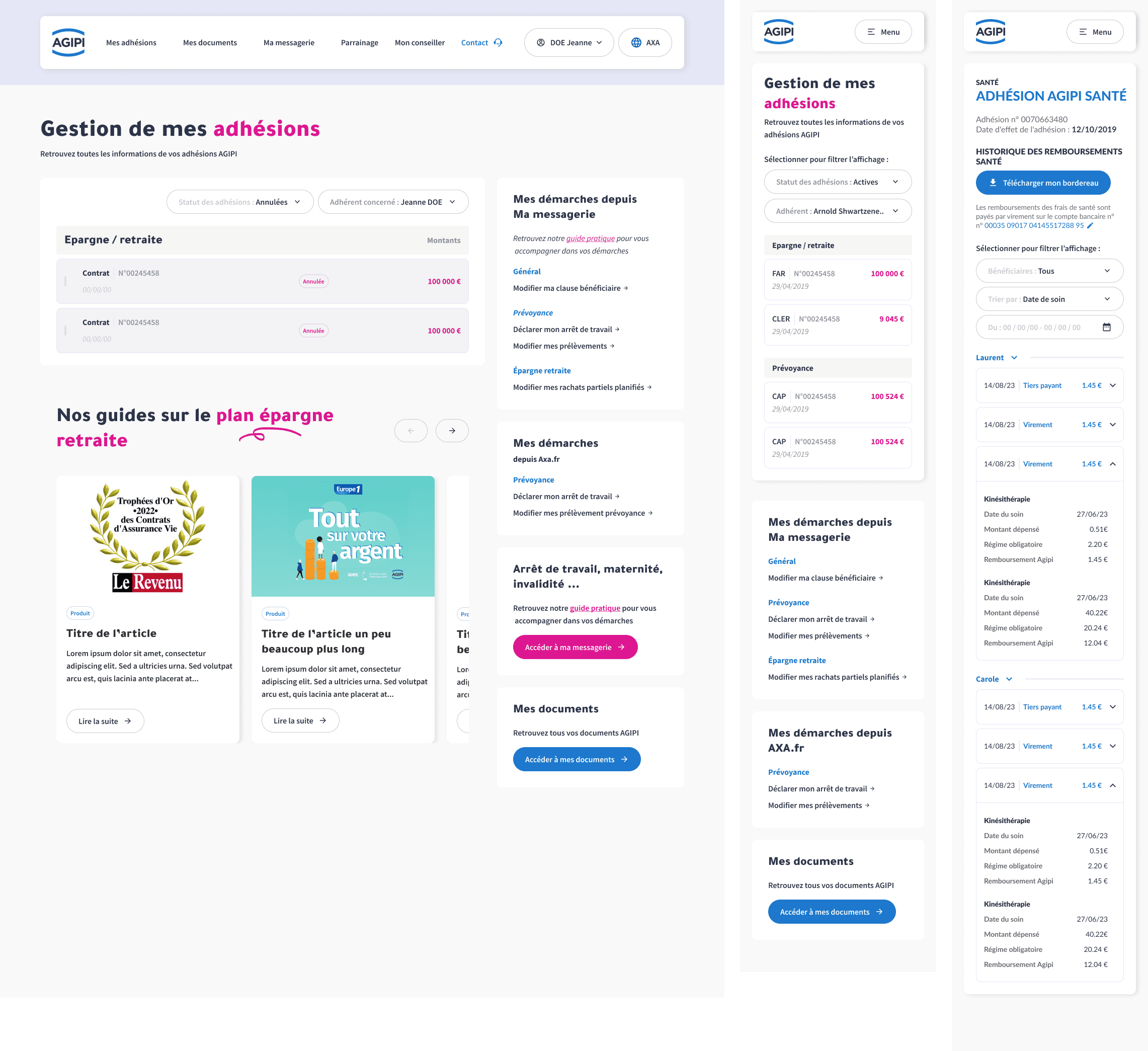
These represent the complete user journey on the Agipi website. No frills, details, or colors here—just a representation of all the pages visible to the user. The idea is to iterate, present the concept to stakeholders, and collaboratively validate a final user flow.
Example with the AGIPI members' website....
Moodboard
For certain projects where the visual identity guidelines were not defined by Agipi, we created moodboards.
A moodboard is a board of trends or inspirations that helps you define the main aesthetic guidelines of a project. This highly effective brainstorming tool allows you to establish the atmosphere and influences you want to bring to your idea.
Exemple with the AGIPI member's website ...
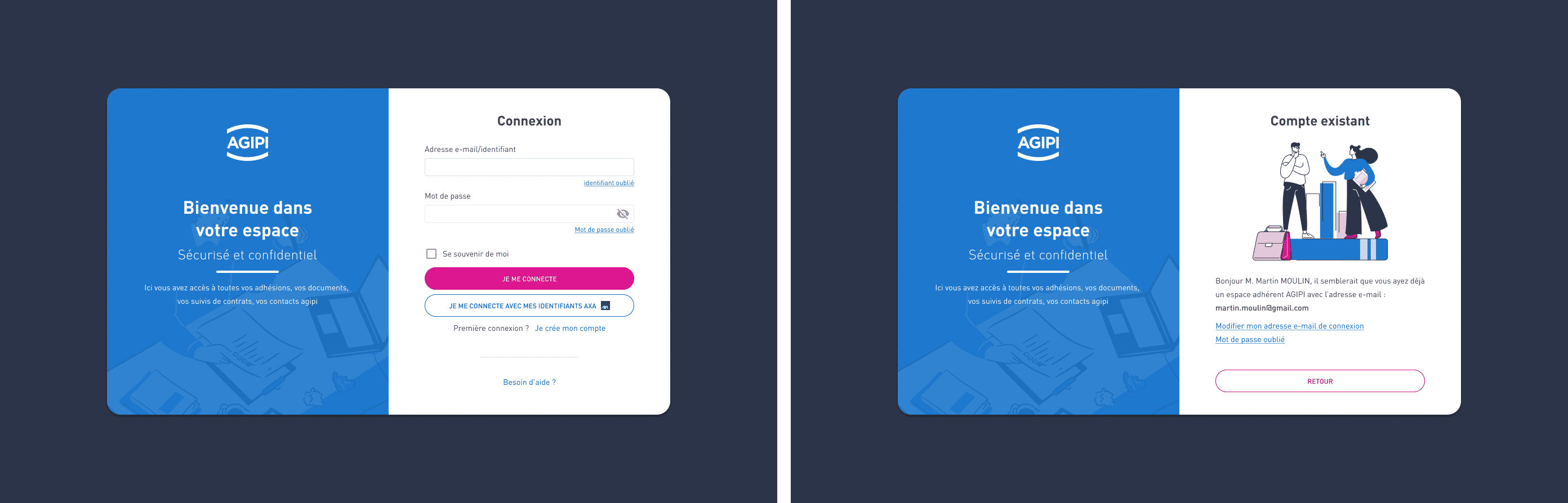
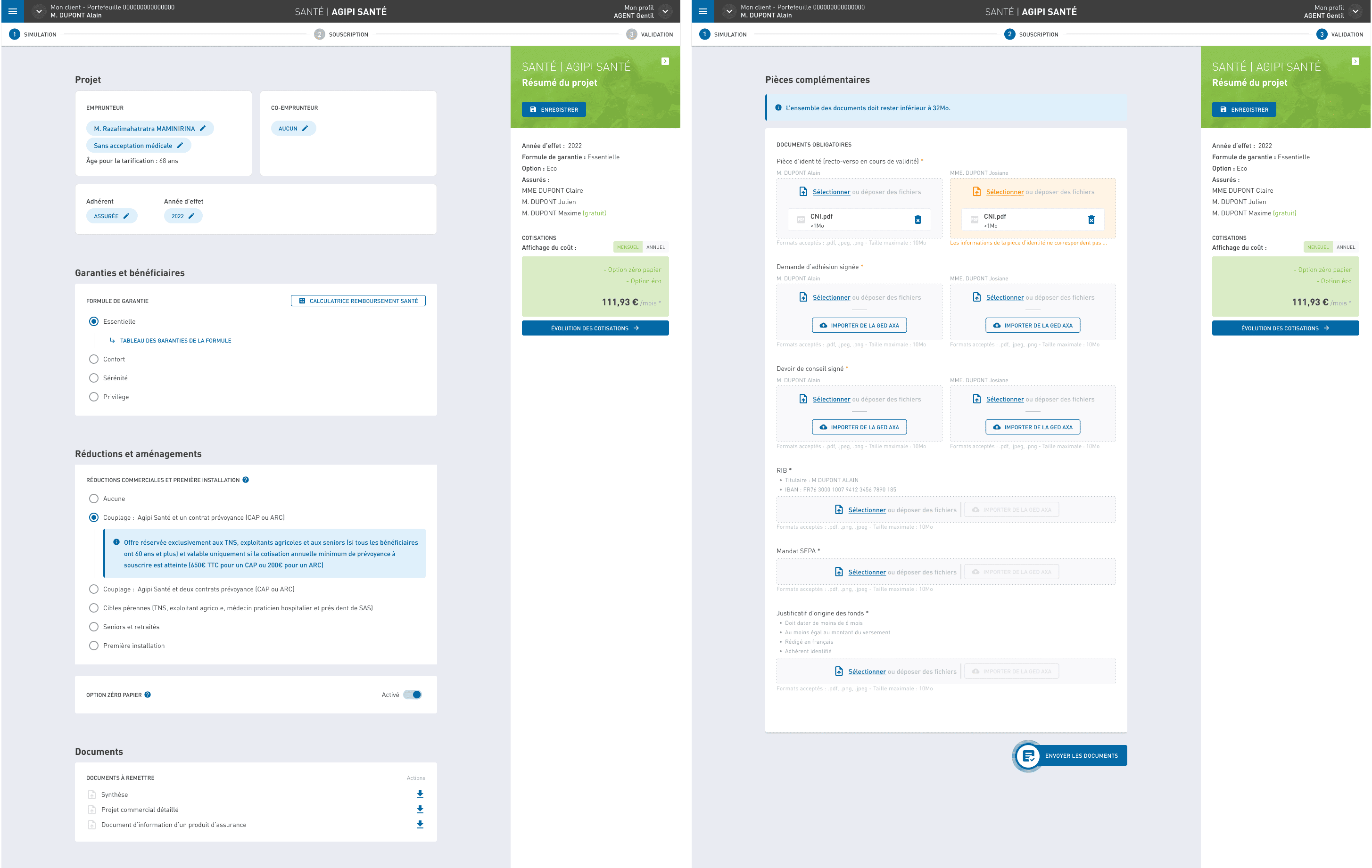
Final design
The final step, after validating the wireframes with stakeholders, is to create high-fidelity mockups that will serve as the foundation for the developers. This is a crucial stage where I maintain constant communication with them. Together, we establish the components and technical constraints for potential features or animations. Within Figma, we leveraged the latest advancements such as a branching system, page versioning, and changelogs to enable business and development teams to closely track changes and updates.
Mockups
High-fidelity mockups
Random examples among hundreds of others...
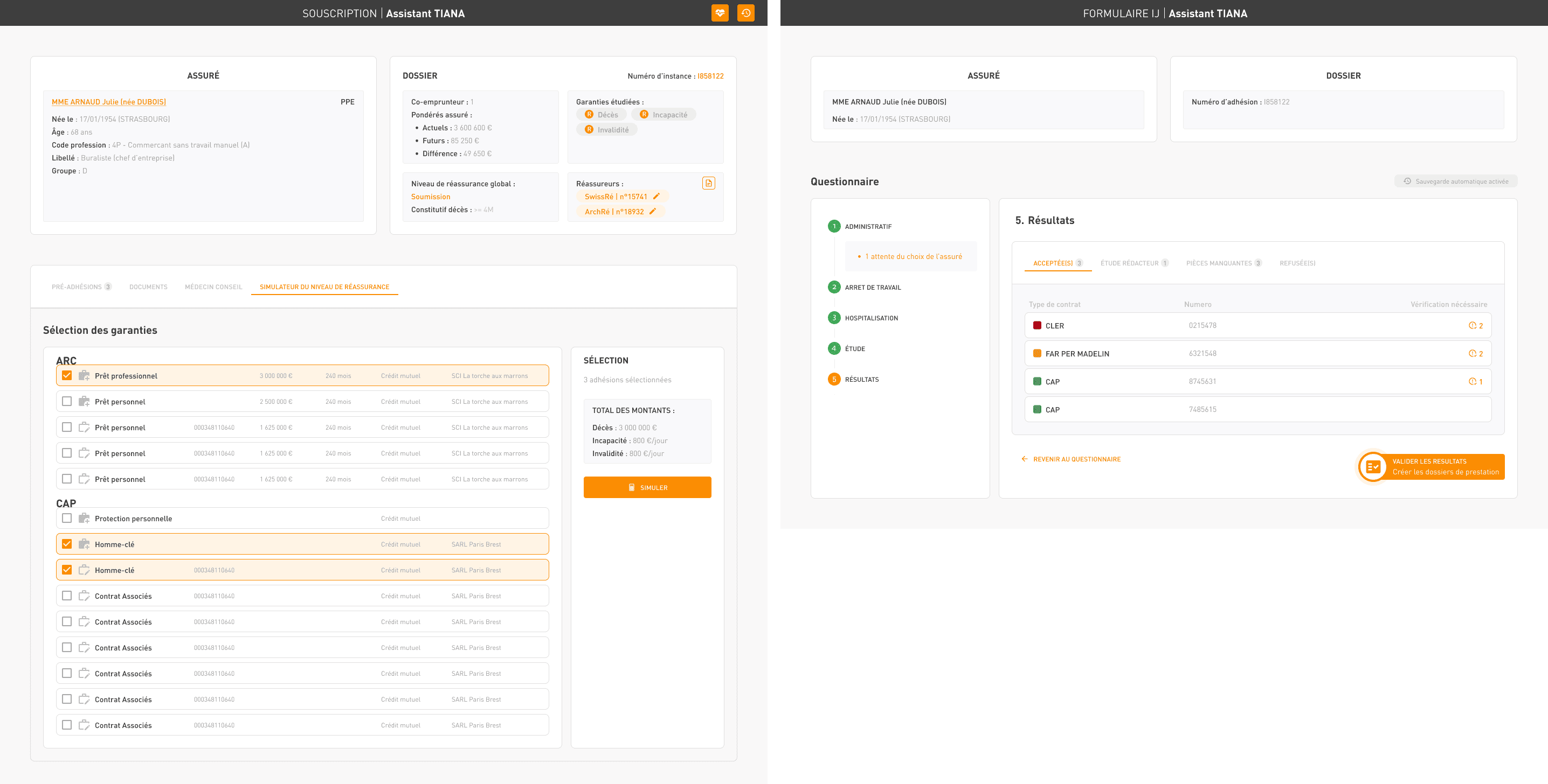
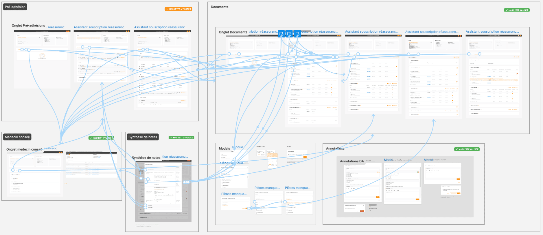
Prototypes
Figma prototypes are interactive mockups that simulate the functionality of an application or website to test and validate user journeys
I transformed my mockups into a test-ready prototype, incorporating gestures and animations
Results
Now, reflecting on my experience as an UI designer at Agipi, I can confidently say it was a fulfilling and rewarding journey. Here are some key takeaways and outcomes from my role, as well as the next steps we envisioned.
Impact
Through a collaborative approach, I worked closely with various teams, including business analysts, developers, and project managers, to refine Agipi’s digital experience. My contributions included optimizing the design system, crafting intuitive interfaces, and ensuring consistent visual identity across platforms.
This effort resulted in:
A streamlined user experience for both clients and internal teams.
Positive feedback from stakeholders, who found the interfaces easier to navigate and more engaging.
An increase in team efficiency, as the design system made collaboration and development faster and more consistent.
What I learned
Even small adjustments to UI components can create a big difference in how users perceive and interact with a service.
Prioritizing user feedback and testing iterations is essential to delivering value and solving real pain points effectively.