Versus.Wine aimed to modernize its online wine & spirits store while developing a new B2B trading platform dedicated to wholesale purchases, auctions, bids, and primeur pre-orders. I was brought in to redesign the entire user experience and create the full “Distribution” version of the platform, addressing both wine enthusiasts and professionals such as estates, merchants, and storage providers.
My role
UX/UI Designer (primarily UI designer) responsible for the full UI audit, interface redesign, creation of the new B2B trading module, and implementation of an improved design system.
I collaborated within a small agile team: two developers, a project manager, a wine-market specialist, and myself as the UX lead.
Responsabilites
Conducted a full UI audit (heuristics, Gestalt principles, user flows)
Performed competitive analysis of e-commerce and wine trading platforms
Redefined key user journeys and aligned business and user needs
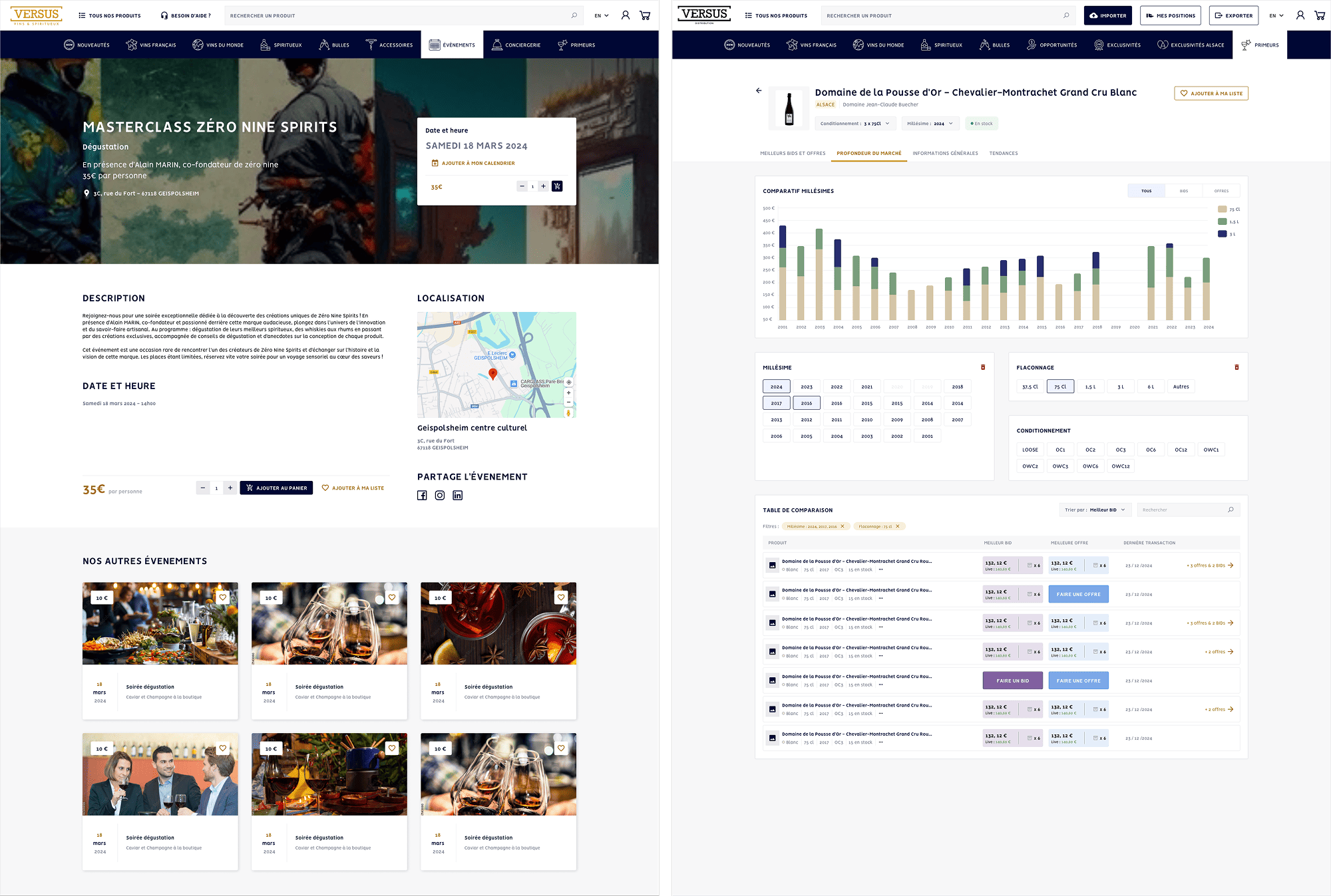
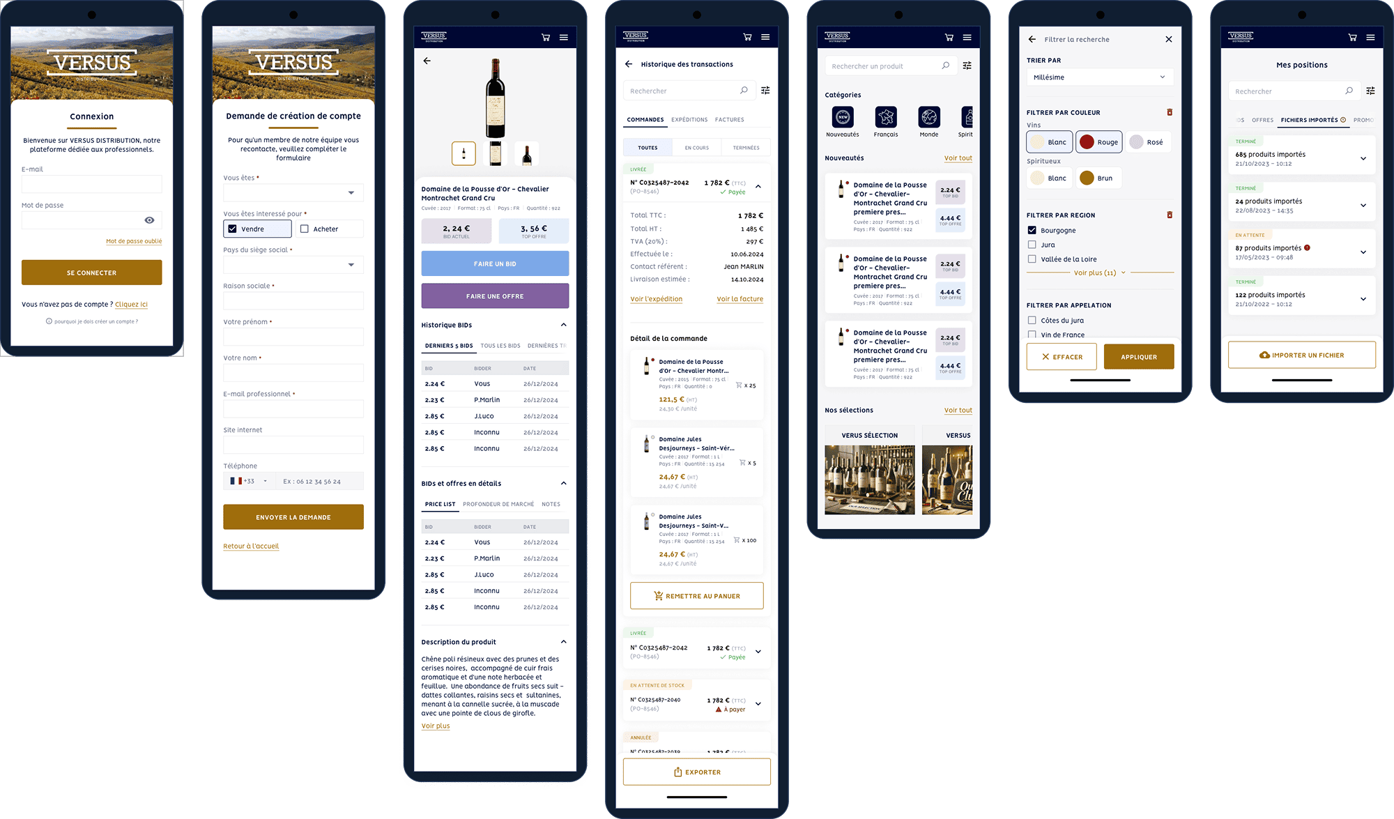
Designed the entire Distribution / Trading module (auctions, bids, lots, VIP club, primeurs…)
Led co-design workshops with developers and stakeholders
Produced wireframes, interactive prototypes, and high-fidelity UI mockups
Reworked the existing UI to improve visual consistency and usability
Built and maintained a scalable design system
Supported developers with continuous design reviews and integration validation
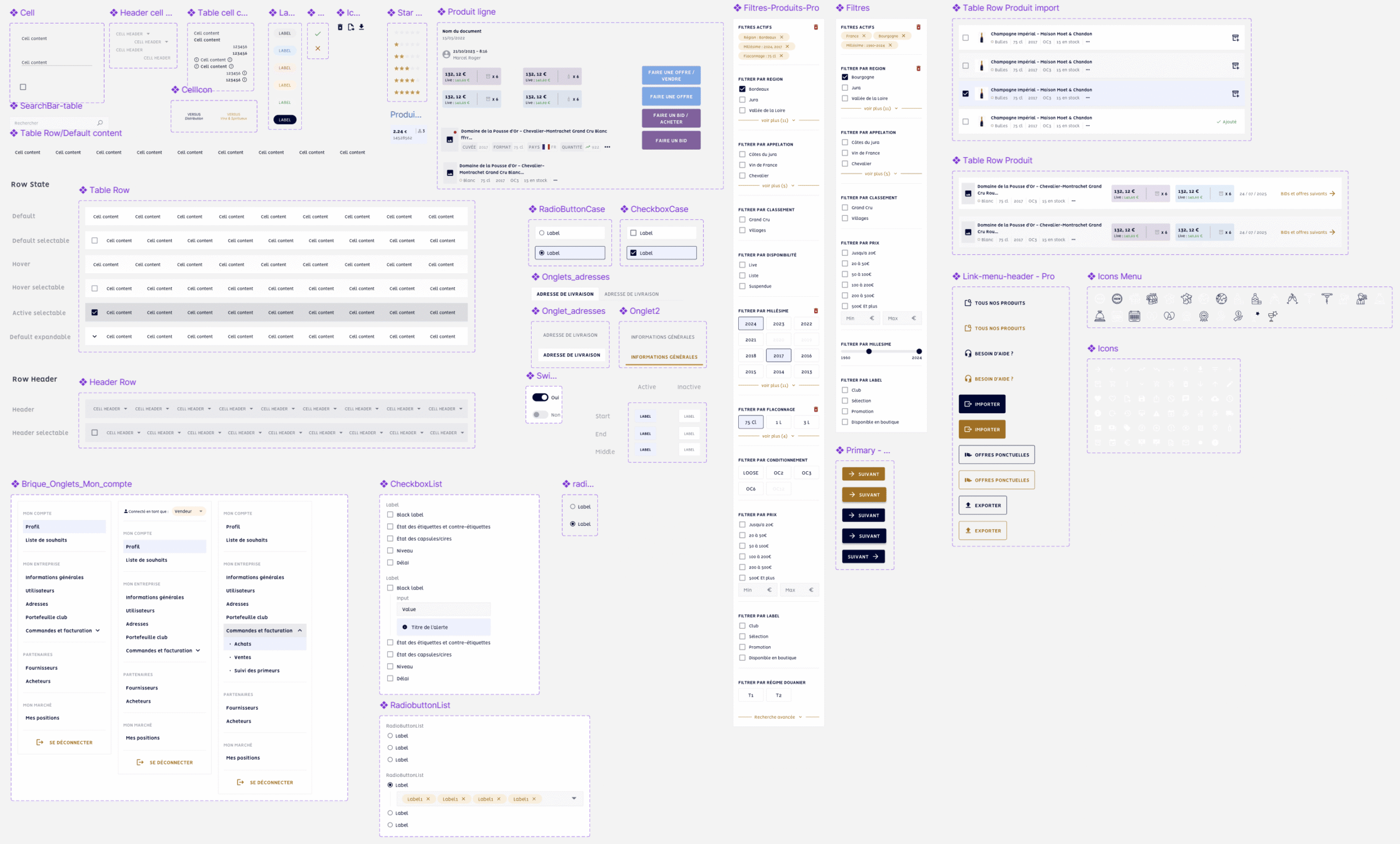
UI kit
Instead of developing a full design system, which wasn’t the initial need for this project, I created a progressive UI Kit that grew as the platform evolved. The project started small and expanded over time, so my role was to provide a solid visual foundation while keeping things lightweight and flexible for the development team.
A growing library of reusable components aligned with the platform’s identity
Patterns and interaction guidelines to keep the product consistent
Component variations adapted to the team’s implementation constraints
Visual assets and specifications designed to work seamlessly with Material and Tailwind CSS
Rather than a heavy, fully documented design system, this UI Kit acts as a practical, modular reference for the developers, who rely on Material and Tailwind for structure while using my components to ensure consistency and a coherent user experience.
Part of UI kit. Yes, it looks messy, that’s what happens when a small project suddenly becomes a big one. For a beautifully structured design system, please refer to my other case studies :p
Tools for Design system
Figmais a collaborative tool for design and prototyping, enabling the creation of components, mockups, and interactive prototypes that simulate a website or app’s final look.
Storybook, more developer-focused, provides a coded component library, making reusable components accessible for all projects, with support for parameters and documentation.
Design
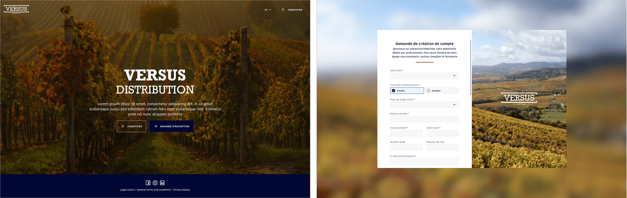
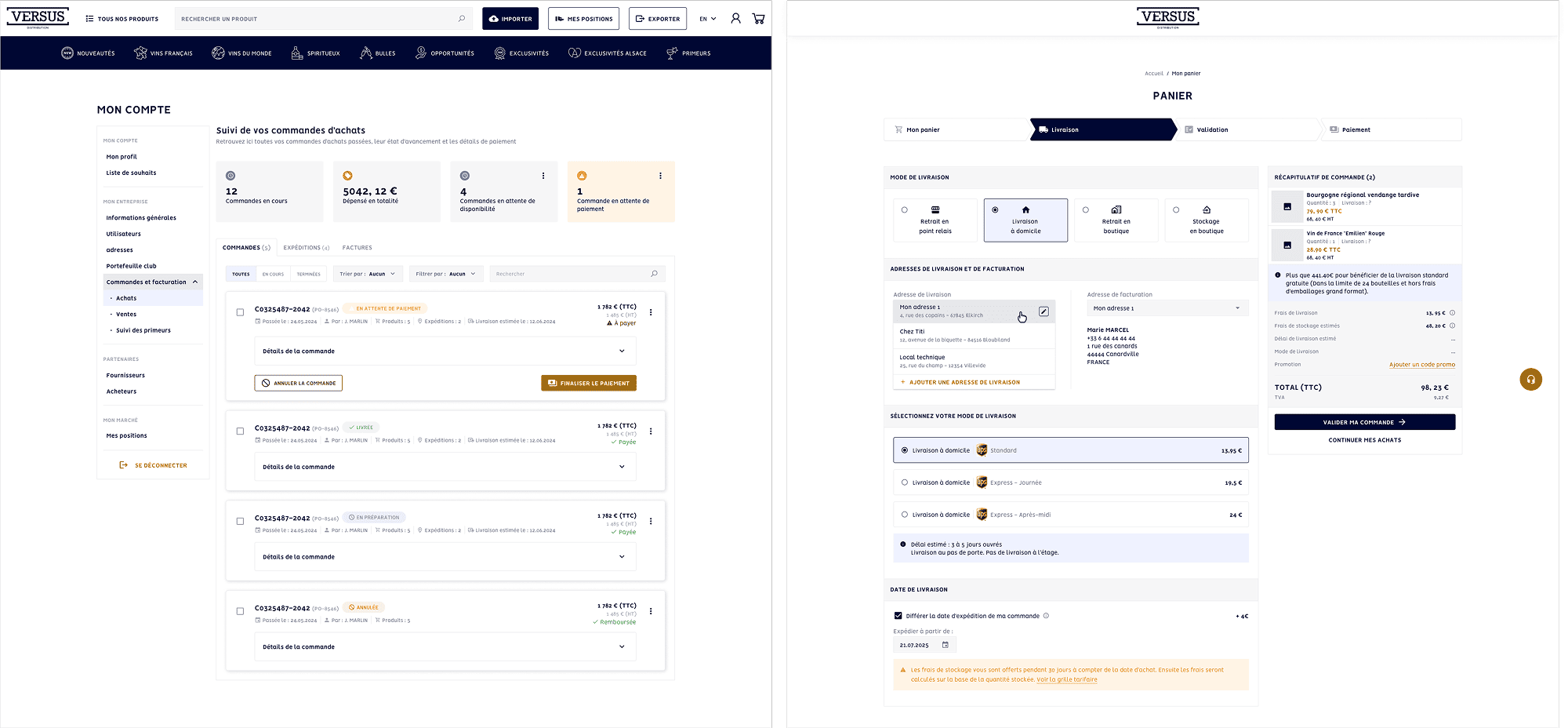
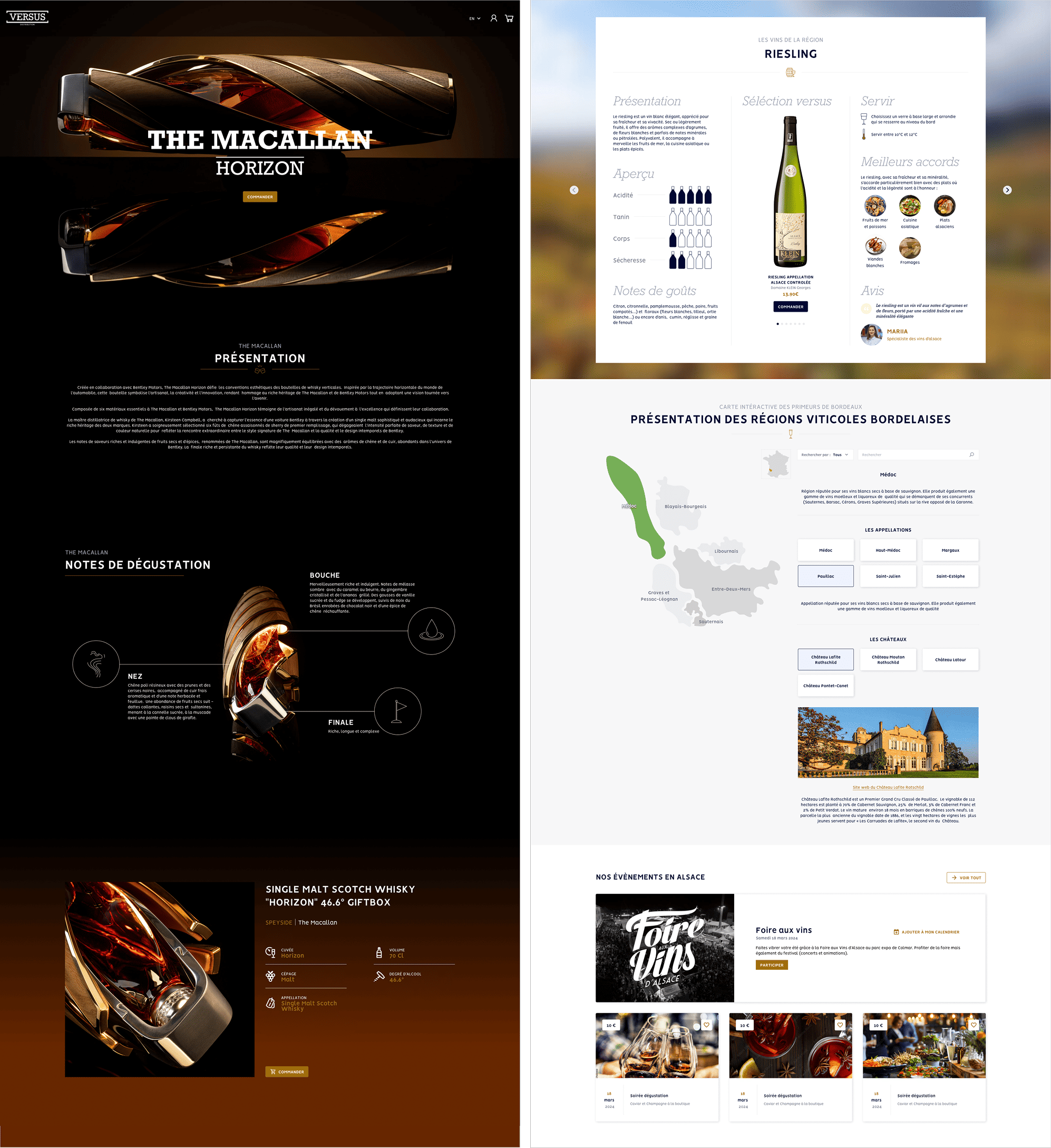
I delivered pixel-perfect, highly structured interfaces focused on clarity and efficiency:
Clear hierarchy of auction information, lots, and critical product details
Streamlined navigation tailored to both B2C and B2B needs
Interactive prototypes used for internal demos and rapid iteration
UI visually refined to reflect the high-end positioning of Versus.Wine
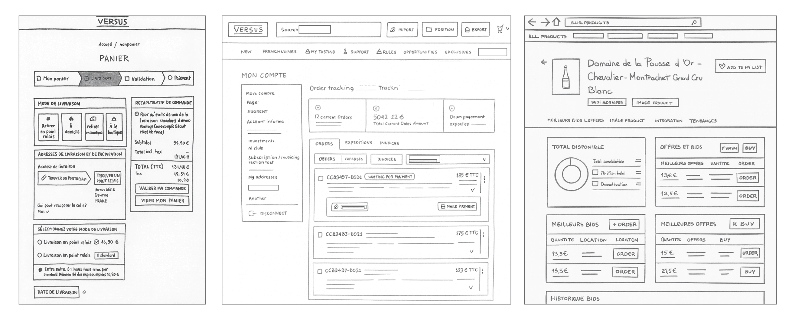
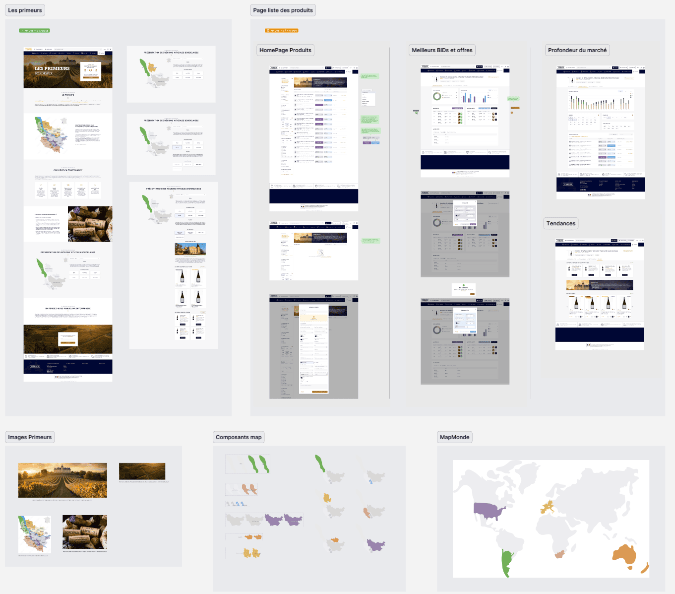
Paper wireframes
oriented on the basic structure of the homepage and highlight the intended function of each element
No frills, details, or colors here, just a representation of all the pages visible to the user. The idea is to iterate, present the concept to stakeholders, and collaboratively validate a final user flow.
Example of small paper wireframes
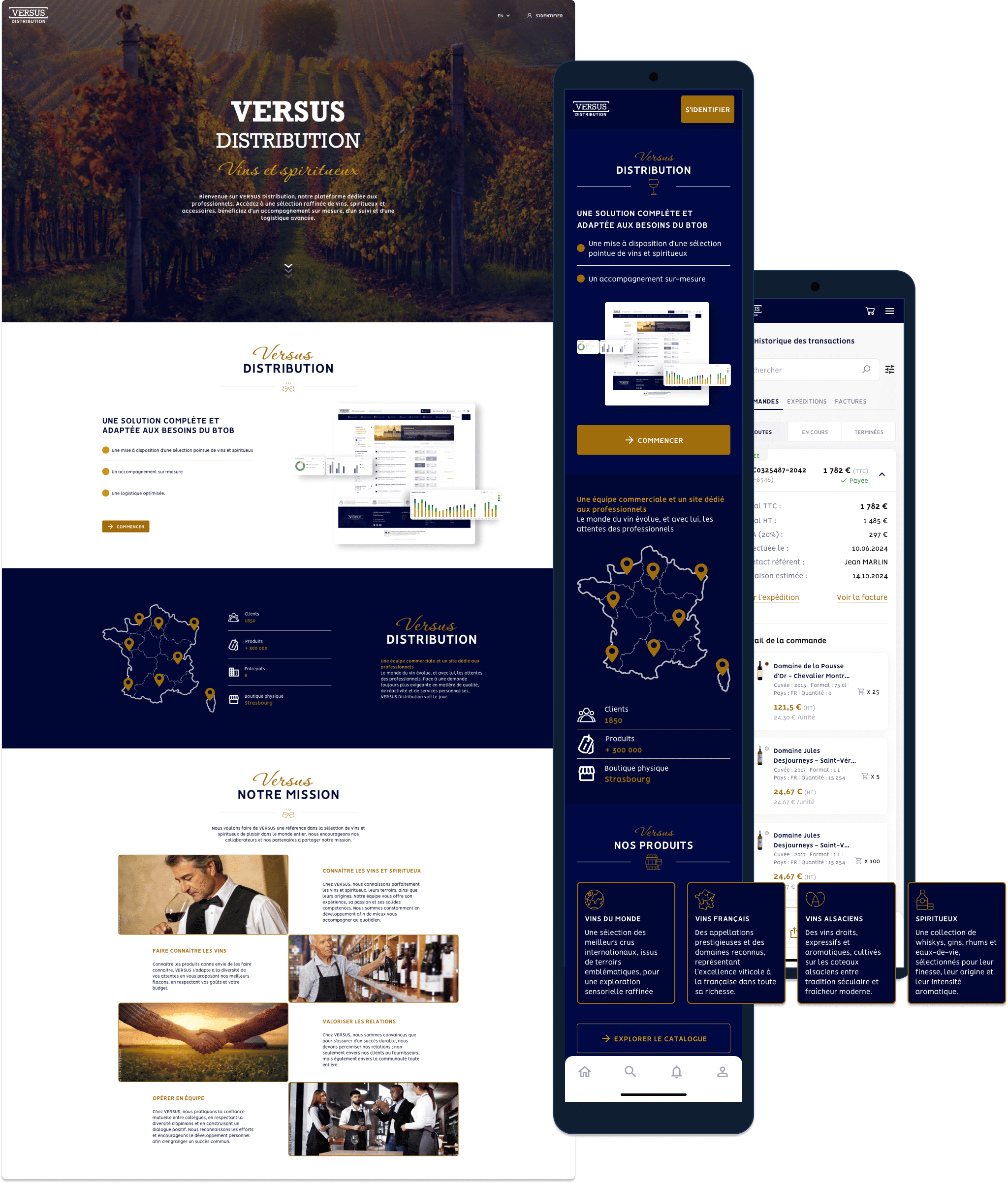
Final design
The final step, after validating the wireframes with stakeholders, is to create high-fidelity mockups that will serve as the foundation for the developers. This is a crucial stage where I maintain constant communication with them. Together, we establish the components and technical constraints for potential features or animations. Within Figma, we leveraged the latest advancements such as a branching system, page versioning, and changelogs to enable business and development teams to closely track changes and updates.
Mockups
High-fidelity mockups
Random examples among hundreds of others...
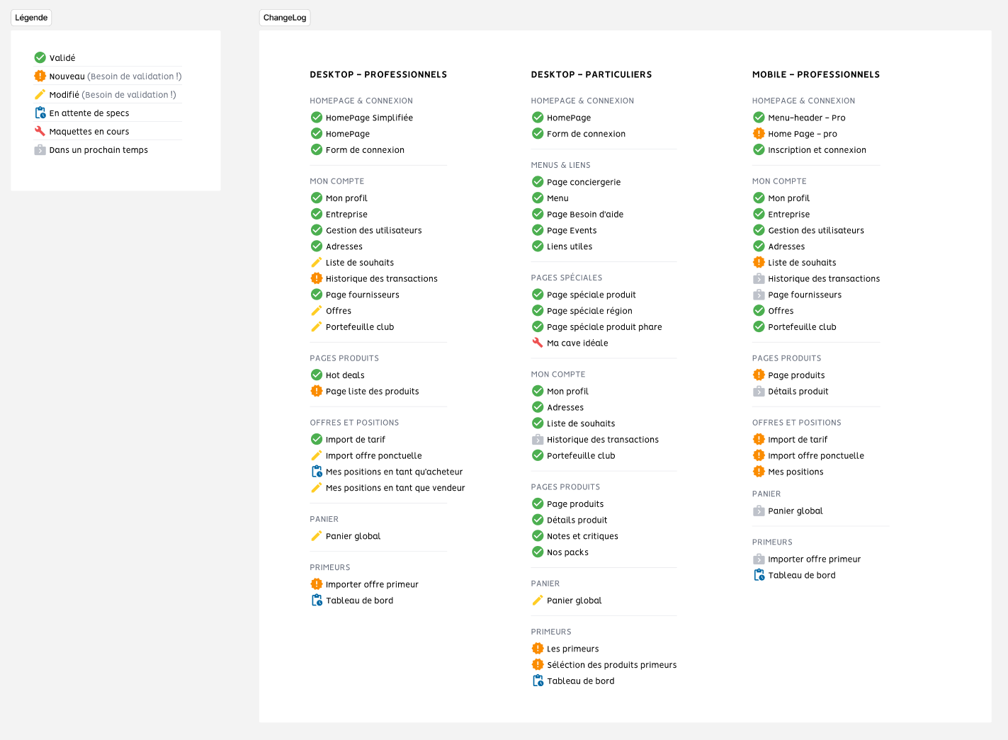
Changelog
Tracking changes and version control
To keep the project organised and transparent, I created a Changelog page in Project. It centralises all updates made to each screen. UX/UI improvements, functional adjustements, design decisions, pending items and next steps. This page gives the team a clear, shared and prevents inconsistencies between versions. The changelog acts as a single source of truth, ensuring smooth collaboration throughout the redesign.
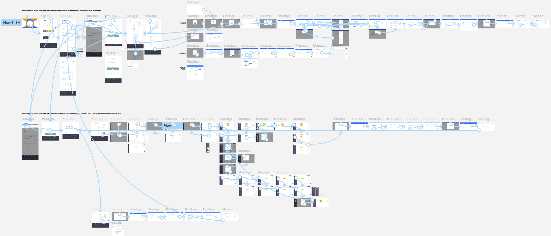
Prototypes
Figma prototypes are interactive mockups that simulate the functionality of my website
I transformed my mockups into a test-ready prototype, incorporating gestures and animations
Results
The redesign brought clarity, structure, and coherence to a platform that had become complex over time. The new trading environment now offers a far smoother experience, with clearer flows and a more intuitive way to navigate auctions, bids, and lot management. The visual identity has been modernized to match the premium positioning of the brand, while the newly created design system provides a solid foundation that speeds up development and ensures long-term consistency. Overall, the project helped the team gain a unified product vision and a more efficient way to collaborate.
Impact
Accelerated development: standardized components and design tokens reduced implementation time and minimized UI inconsistencies
Higher product usability: reorganized information architecture and simplified interactions made the platform easier to navigate for both novices and professionals
Stronger brand presence: a more premium visual identity improved the perceived value of the platform and its products
Future-proof scalability: the new design system and modular UI support long-term expansion without fragmentation
Cross-team efficiency: smoother communication between UX, developers, and marketing improved the quality and speed of iterations
What I learned
This project allowed me to deepen and refine my methods on highly complex product logic, especially within the overlap of e-commerce and professional trading workflows. It challenged me to streamline large amounts of information while maintaining a clear, intuitive experience across dense interfaces.
Creating the design system, an area in which I’m already highly experienced, gave me the opportunity to apply advanced standards of structure, accessibility, and consistency, while collaborating closely with developers to ensure an implementation that was both scalable and technically sound.
The project also reinforced the importance of co-design sessions, continuous communication, and tight alignment between business, technical teams, and UX to accelerate decision-making and maintain a strong shared product vision within a small team.